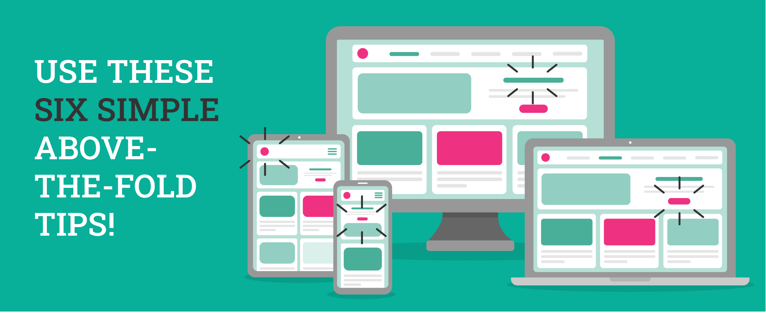
When someone clicks on your website, the very first thing they see is the top section of your homepage. That’s called your “above-the-fold” content.
Above-the-fold is a charming little antique phrase that dates back to the daily newspaper days. Back then, publishers would put their very best, most sensational headlines, images, and attention-grabbers on the top half of their newspaper, right above the half-fold. The goal? Give away just enough of the day’s top stories to entice passersby to purchase a paper.
Today, your website doesn’t have a fold or a front cover, and it’s certainly not sitting face-up in a sidewalk newsstand. But it does have about the same amount of time (roughly .05 seconds) to grab your visitors’ attention.
Want above-the-fold content that stops your dream customers right in their tracks, speaks to their needs in mere milliseconds, and encourages them to scroll? These six eye-catching elements create an above-the-fold section that drives above-average results:
1. A clear Unique Selling Proposition
Your above-the-fold content is like a billboard for your business. It should instantly tell visitors what you do and what makes that uniquely great. Aim for a short, clear statement that speaks directly to your ideal customer’s problem— and your amazing solution.
2. Visuals that engage— not distract
Choose an image, video, or graphic element that tells your brand’s story, but doesn’t overwhelm your visitor. Collages, flashing images, a novel’s-worth of text… These are instant turn-offs. But a clear heading, simple image or graphic, and tasteful colors invite these visitors into your brand story.
3. Fast-loading visuals
There’s nothing more frustrating than clicking on a link that takes forever to load. And online, a few seconds can feel like an eternity! If your page takes just five seconds to load, the chances of your visitor giving up and closing the page increase by 90%. If it takes 10 seconds to load, the probability of your user clicking away increases by 123%! That’s valuable business, lost in mere seconds.
Whatever visual you choose for your above-the-fold content, make sure it loads almost instantly— before your customer clicks away or scrolls right past your greatest stuff.
4. A clear call-to-action
What next step would you love your visitors to take? Give you a call? Book a consultation? Or just start shopping? Tell them with a big ol’ button they can’t help but click. The best call-to-action buttons are super short and stand out with an attention-grabbing color.
5. A scroll-encouraging element
Consider adding a strategic element that invites your visitor to scroll beyond the fold, like a down arrow or text that says “Scroll to learn more.” You can even experiment with adding a text box or image just high enough on your above-the-fold area that it gets cut in half by the screen. To view the full image or keep reading, your visitor must scroll down a bit. And once they start scrolling, they’re likely to continue!
6. Mobile optimization
In 2021, mobile traffic accounted for over 50% of all web traffic. If your customers are landing on your website from social media or emails, your site likely has even higher mobile traffic. That means your above-the-fold content must be optimized for both computers and phones (and tablets, while you’re at it!). When planning your top content, be mindful of users’ screen size. For the best possible results, have your web designer create a different version of your above-the-fold content for each screen size— highly tailored to each device category.
Wondering if your above-the-fold gets the job done? Let us take a look!
At MediaSpark, we use data-driven strategies and time-tested experience to create websites (and campaigns and emails and other awesome assets) that work as hard as you do. Give us a call or send us a message to talk about your website wishes!
